The context
While checking out at Whole Foods, I was presented with a jarring, confusing message by the credit card machine, causing me to remove my card too early. that caused people to withdraw their cards before the transaction was done.
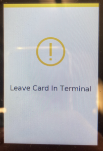
My role
I was User, Researcher, Content Designer, and Product Designer for this one.
My process
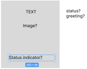
I started by interviewing the cashier and learned this was an ongoing issue. Then I took a photo of the existing terminal. When I got home, I scratched out some notes about what was missing and what an ideal experience might look like.
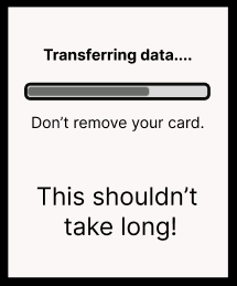
I felt like there needed to be some indication of something happening and how long it might take… This would align with Nielsen’s first heuristic of interface design – Visibility of System Status
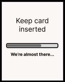
With limited space, it also seemed important to limit the messaging so the user isn’t overloaded and can focus on what’s most important.
Solution
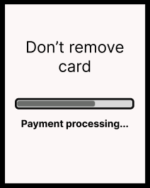
My final design wasn’t quite as friendly as some of the others, but leading with “don’t” would hopefully stop users in their tracks. And now the status bar explains what they’re waiting for, not how long is left. The bar itself should give some sense of time (even if it’s not actually tracking anything).