Role
UX Content Designer
Collaboration
Product Owner, Researcher, Product Designer
Product
Workforce scheduling
Contribution
Content strategy, interaction design, content hierarchy
The challenge
Two choices. One confusing interaction.
A scheduling feature allowed administrators to assign an employee to a shift requiring a labor level that wasn’t assigned to that employee in the system.
For example, an employee might have experience working as a bartender but only have a server labor level assigned in the company’s system. When an administrator scheduled that person for a bartending shift, the product presented two ways to resolve the mismatch:
- Change the employee’s labor level to match the shift.
- Change the shift’s labor level to match the employee.
Both were valid options, but the interface presented them as competing buttons without enough context to explain what each choice actually changed.
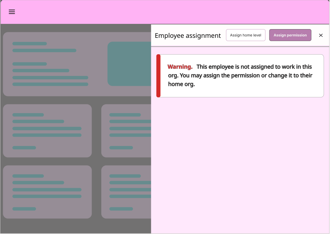
The original experience — two different actions presented as competing buttons, with limited room to explain the distinction.
Understanding the problem
First, I needed to understand what was actually changing.
I started by working through the issue with the product owner, who walked me through the steps that triggered the scheduling conflict. I repeated the process myself to understand what administrators were seeing and what decisions they needed to make.
A conversation with the researcher also surfaced that labor levels were confusing for other people, too. This wasn’t simply a matter of polishing two button labels. The underlying concept needed to be easier to understand.
I mapped out the relationship between the employee’s assigned labor level and the labor level required by the shift. This helped me understand the conflict and identify what each available action would actually change.
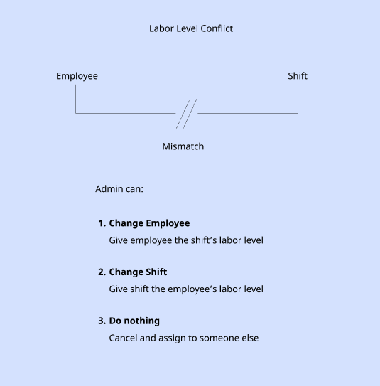
Mapping the labor-level conflict between an employee and a scheduled shift.
Mapping the two choices
I wrote out what each option would actually change. One action changed the employee’s labor level; the other changed the shift’s labor level. Although the distinction seemed straightforward once mapped out, it wasn’t apparent in the original interface.
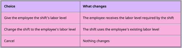
Mapping what changes — separating the two actions helped clarify their different consequences.
The evolution
When the words weren’t enough
I initially approached this as a content problem: could I make the two choices clear enough to work within the existing two-button pattern?
I explored ways to make the labels short but more specific. Each button needed to communicate more than an action. It needed to tell administrators what would change and help them understand the difference between the two outcomes.
As I tried to add more meaning, it became clear that the explanation couldn’t fit into a few words on a button. The limitations of the existing pattern were getting in the way of the content.
Initial approach
Make the button labels clearer
Find short, action-oriented language that distinguishes changing the employee’s labor level from changing the shift’s labor level.
Emerging realization
The choices needed more explanation
The more explicit the wording became, the more apparent it was that administrators needed context—not just shorter, better labels.
Change in direction
Give each choice room to explain itself
Rather than continue optimizing the button labels, I explored a different interaction pattern that could accommodate a heading and supporting explanation for each option.
Illustrative reconstruction of the content-design progression. The original wording explorations were not retained.
My first attempt stayed within the existing two-button structure. But even with revised language, the choices remained difficult to understand. The pattern didn’t give the content enough room to do its job.
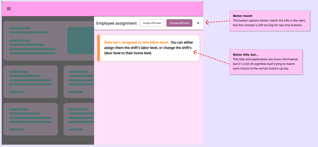
First iteration — improving the wording alone wasn’t enough to make the decision understandable.
Rethinking the interaction
A better pattern for a more informed choice
I moved away from the two-button approach and explored a layout that brought the explanation and choices together. Each option could have its own heading and supporting description, with both choices presented at equal weight.
Radio buttons offered a more familiar way to communicate that administrators were choosing between two alternatives, rather than selecting a primary or secondary action.
I also made room for a clear cancel action, so administrators could leave the interaction without making a selection.
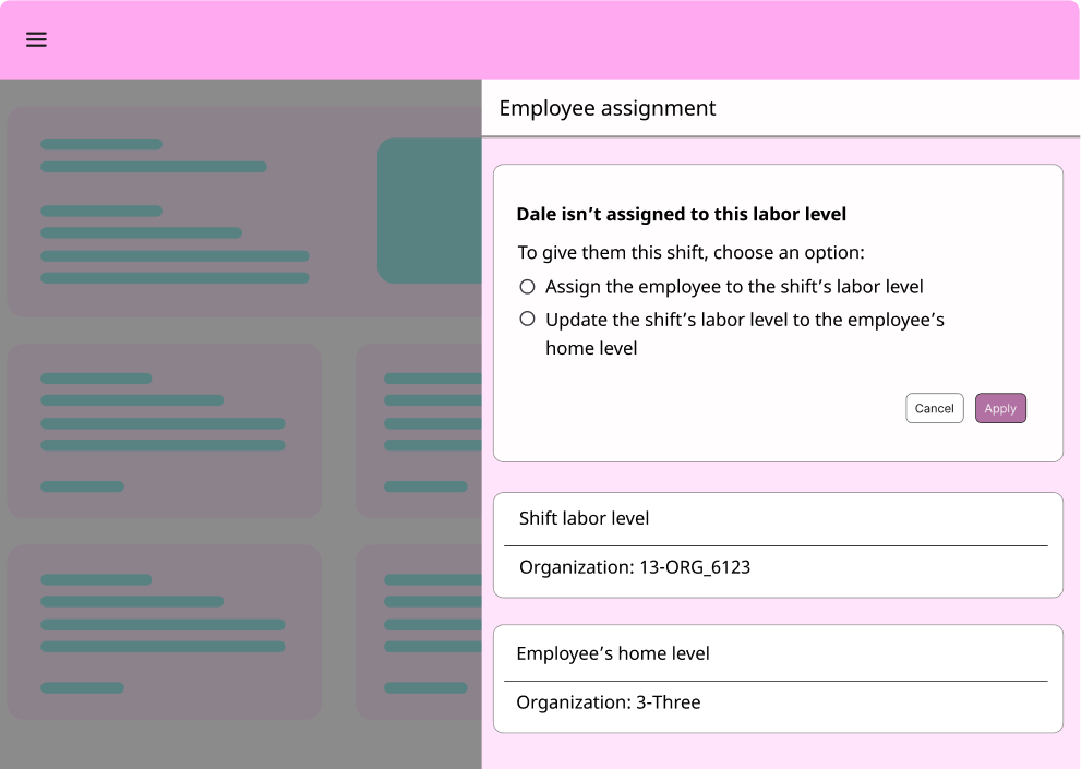
Ideal experience — each choice has room for an explanation and both options receive equal weight.
Working within the design system
The ideal solution wasn’t available in the existing system
The ideal layout required a component that wasn’t available in the company’s design system. Creating a new component for this contained interaction wasn’t a practical option.
I needed to preserve the clarity of the revised approach while working with the components the product already had. That meant separating the explanation from the decision and using an existing radio-button pattern within the available layout.
The progression
Initial exploration: Improve the original button labels.
Ideal direction: Give each choice its own explanation.
Shipped direction: Use existing components to preserve the clarity of the revised approach.
The shipped solution
A practical compromise that preserved the intent
The final approach separated the explanatory alert from the decision itself. A dedicated radio-button panel gave administrators room to read and compare the two choices.
The primary and secondary buttons could then serve their more familiar purpose: Continue and Cancel. Instead of forcing two equally valid choices into competing button treatments, the interface made the decision itself clearer.
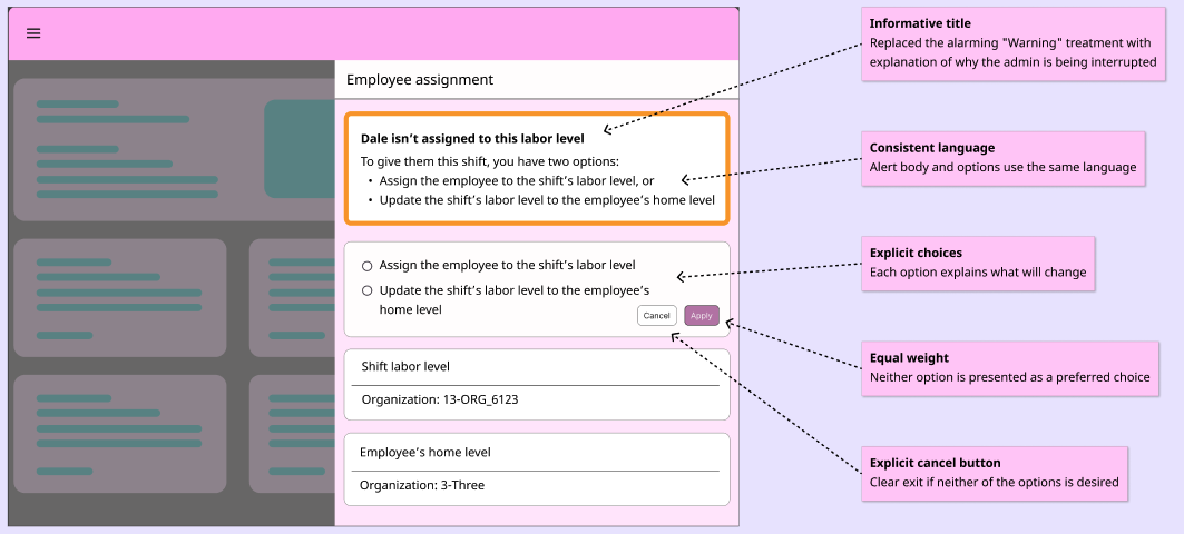
Final solution — the revised layout used existing components while giving the two choices more room and a clearer structure.
The result
A clearer relationship between the problem and the choice
The final design changed more than the words on the screen. It changed how the information was organized, how the two options were presented, and how administrators could act on what they understood.
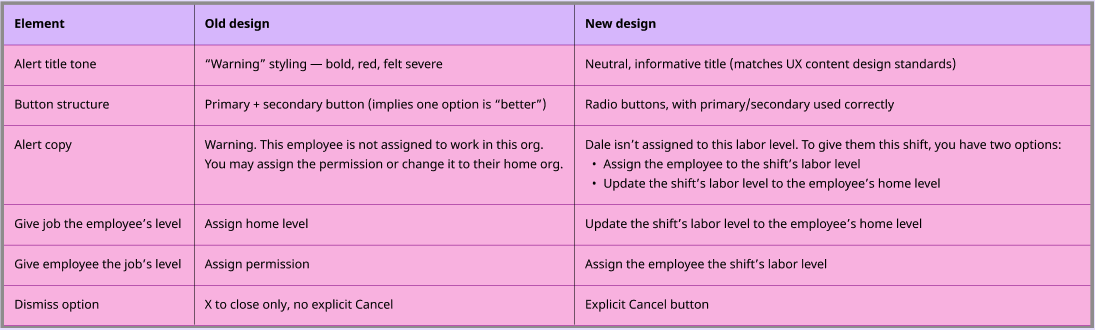
Before and after — the revised experience made the distinction between the two choices more visible and gave each action room for context.
Reflection
Sometimes clarity requires changing the pattern
This project reinforced that content design isn’t always about finding better words. Sometimes it’s about recognizing when the interface doesn’t give those words a chance to work.
What began as a request to clarify two button labels became an opportunity to rethink the interaction itself. By identifying what administrators needed to understand before making a choice, I could help shape a solution that gave the content—and the decision—the space they needed.
Interface visuals in this case study have been recreated for portfolio purposes.