The context
While checking out at Whole Foods, I was presented with a confusing message on the credit card terminal. The experience caused me to remove my card before the transaction was complete.
I asked the cashier about it and learned this wasn’t an isolated incident. Customers were regularly removing their cards too early because the terminal wasn’t clearly communicating what was happening.
My role
I was the user, researcher, content designer, and product designer for this project.
My process
I started by talking with the cashier to understand whether this was a one-off problem or something they saw regularly. Their experience confirmed that customers frequently removed their cards before the transaction was complete.
I then photographed the existing terminal and looked at the experience from the ground up—not just the words, but how the different elements on the screen were working together.
Conflicting signals
The original experience had two elements that seemed to work against each other.
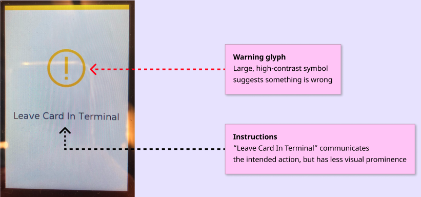
At the top of the screen was a large, bright yellow warning glyph: a circle with an exclamation point. Because it was visually dominant, I interpreted it as a warning that something was wrong—or that I needed to take action.
Below it, the terminal told me: “Leave Card In Terminal.”
The words were technically giving me the right instruction, but the visual hierarchy was telling a different story. The warning symbol was louder than the instruction, and its tone suggested that something might be wrong.
That made me question the experience beyond the copy itself.
Was the symbol helping or hurting?
Was the tone appropriate for a routine part of the transaction?
Was the visual hierarchy directing attention to the right information?
I realized the solution wasn’t simply to rewrite the message. I needed to rethink how the symbol, language, and hierarchy worked together.
Designing from the ground up
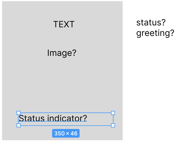
I started exploring what information the experience actually needed to communicate.
First, users needed to know that the transaction was still in progress. Second, they needed to know what action to take—or, more importantly, what action not to take.
This aligns with Nielsen’s first usability heuristic: Visibility of System Status.
01 — Explore
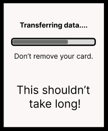
I explored ways to give users some indication that the transaction was still in progress. If the terminal is going to ask someone to wait, it should give them some reassurance that something is actually happening.
02 — Refine
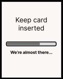
With such limited screen space, I also wanted to avoid introducing more information than the user needed.
The goal was to create a clearer hierarchy:
1. Tell users what is happening.
2. Make the required action unmistakable.
3. Use visual elements to reinforce the message rather than compete with it.
The ideal experience
My ideal version moved away from the warning-oriented treatment and toward a calmer, more informative experience.
Instead of using a visually dominant warning symbol, I wanted the interface to communicate that waiting was a normal part of the transaction. The progress indicator could reinforce that something was happening without suggesting that something was wrong.
The content would then provide the explicit instruction the user needed: leave the card in the terminal.
The constraint
The existing design system and terminal limitations meant I couldn’t fully realize the ideal experience exactly as I envisioned it.
Rather than compromise the most important piece of information, I prioritized the content that would prevent the user error: don’t remove the card.
This meant moving forward with a solution that wasn’t my ideal design, but preserved the most important change: making the instruction itself impossible to miss.
The solution
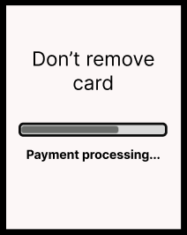
My final design deliberately led with a direct instruction: “DON’T REMOVE CARD.”
This wasn’t simply a copy change. It was the result of rethinking the relationship between the message, tone, and hierarchy.
The original experience used a warning symbol to attract attention, but that attention worked against the intended behavior. My solution used the content itself as the primary signal.
It isn’t the friendliest possible wording, but in this context, clarity was more important than conversational tone. If the biggest risk was that someone would remove their card too early, the most important instruction needed to be the most prominent thing on the screen.
I also changed the role of the progress indicator. Rather than trying to communicate exactly how much time was remaining, it simply reinforces that the transaction is still in progress.
The result is a simpler hierarchy:
1. Don’t remove your card.
2. Your transaction is still processing.
3. The progress indicator reinforces that something is happening.
The goal wasn’t to add more information. It was to make the existing information work together—using symbol, tone, hierarchy, and content to guide the user toward the right behavior.