The opportunity
Empty states are unavoidable in a product like Paychex. They appear when users haven’t added anything yet, have completed a task, or there’s no info to display.
Stumbling upon one of these components doesn’t have to feel like a dead end. They can be a perfect, in-the-moment opportunity to give users a little guidance. And, with a light touch, even bring a bit of brightness to someone’s day.
My approach
Paychex research shows users appreciated moments of humor and whimsy when they feel the situation is appropriate.
Empty states can be a natural place to introduce that personality. When the mood is right, the copy can be more playful while still making the current state clear and helping users understand their next step.
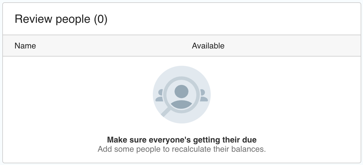
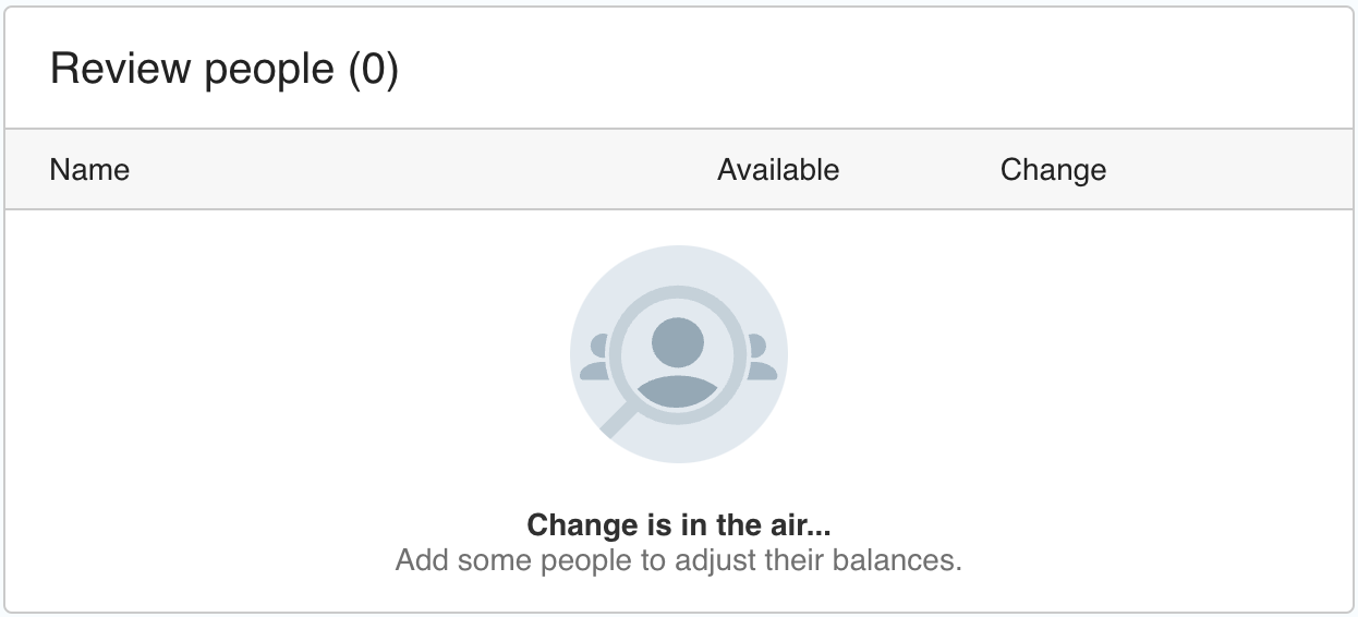
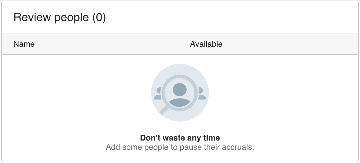
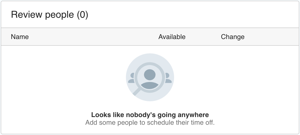
For this series of empty states, I explored short, playful messages that used humor and wordplay without letting the joke overshadow the information users needed.
Content principles
- Communicate the state clearly
- Stay concise and easy to scan
- Feel appropriate to the situation
- Add personality without distracting from the task
- Use humor that was understandable without requiring interpretation
The solution
Using humor and puns, I added a human touch to otherwise routine moments throughout the product.
The result was a collection of empty states that did more than tell users there was nothing to see. They gave the product a more human voice while maintaining clarity and usability.