Role
UX Content Designer
Collaboration
Product Designer
Product
Time-off management
Contribution
Experience architecture, interaction design, content hierarchy
The challenge
AI was arriving quickly. The experience needed more thought.
The product team wanted to introduce AI-assisted recommendations into its time-off management experience. The feature would help administrators evaluate employee requests by considering factors such as PTO usage, attendance history, holidays, and staffing coverage.
The initial design introduced AI recommendations alongside existing request information and approval controls. But the layout raised questions about how recommendations should fit into the decision-making process, how administrators would access supporting information, and how to distinguish AI assistance from actual approval actions.
I was initially asked to review the content. As I examined the design, I recognized broader opportunities to improve the experience. I began independently exploring alternative layouts and interaction patterns, then shared those proposals with the product designer for implementation.
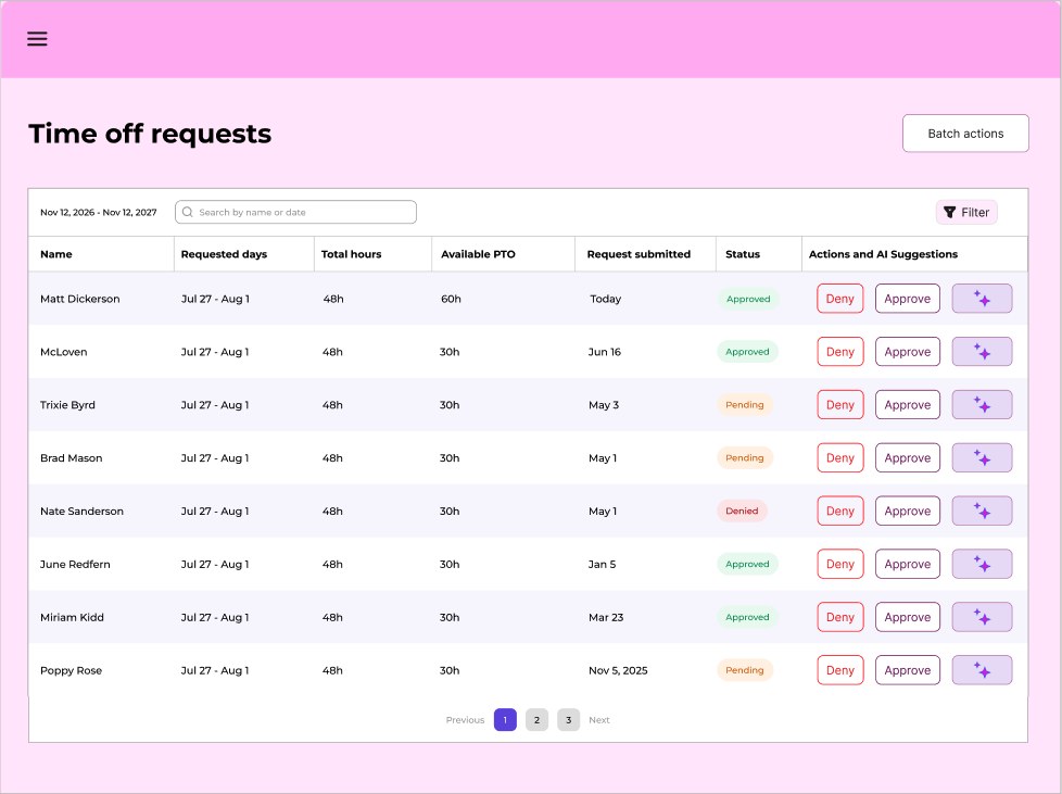
Iteration 1 — a portfolio-safe recreation of the initial design that prompted a broader review of hierarchy and workflow.
The evolution
Seven iterations toward a simpler experience
The design moved from a prominent AI recommendation column to a quieter, on-demand way to explore supporting information.
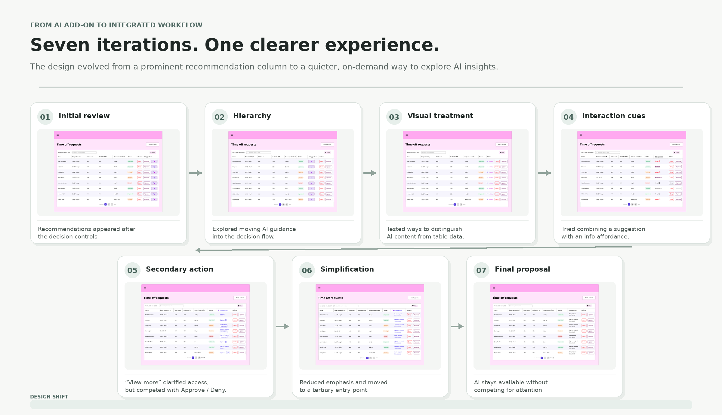
The interface visuals throughout this case study are recreated for portfolio purposes.
01 · Information architecture
Establishing the right information hierarchy
The initial design placed AI recommendations after the administrator’s decision controls. That created a disconnect between the information administrators needed to make a decision and the actions they were expected to take.
I saw two opportunities to improve the structure:
- Make AI recommendations available before administrators reached the approval controls.
- Establish a clearer relationship between section headings and the information they introduced.
Rather than treating AI recommendations as another column of information, I explored ways to integrate them more naturally into the decision-making workflow.
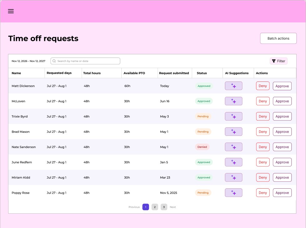
Iteration 2 — exploring a more prominent treatment.
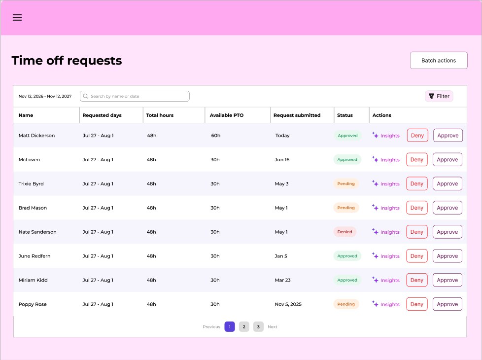
Iteration 3 — continuing to explore hierarchy and presentation.
02 · Interaction design
Untangling recommendations from interactions
I realized I was asking individual interface elements to communicate too much.
One approach combined a short recommendation, an underlined interactive word, and an information icon. Within a very small space, I was trying to communicate the suggestion, provide access to additional information, and explain what that interaction would do.
Adding a secondary “View more” button improved clarity, but introduced another problem: it competed with the primary Approve and Deny actions. It was also smaller and less accessible, adding visual clutter without enough benefit.
I experimented with different treatments before arriving at a simpler solution: a tertiary control that allowed administrators to access AI details on demand. This preserved access to the recommendations without introducing another prominent action into an already busy interface.
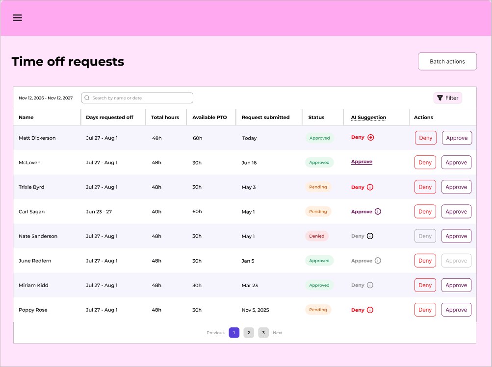
Iteration 4 — exploring interaction cues and supporting information.
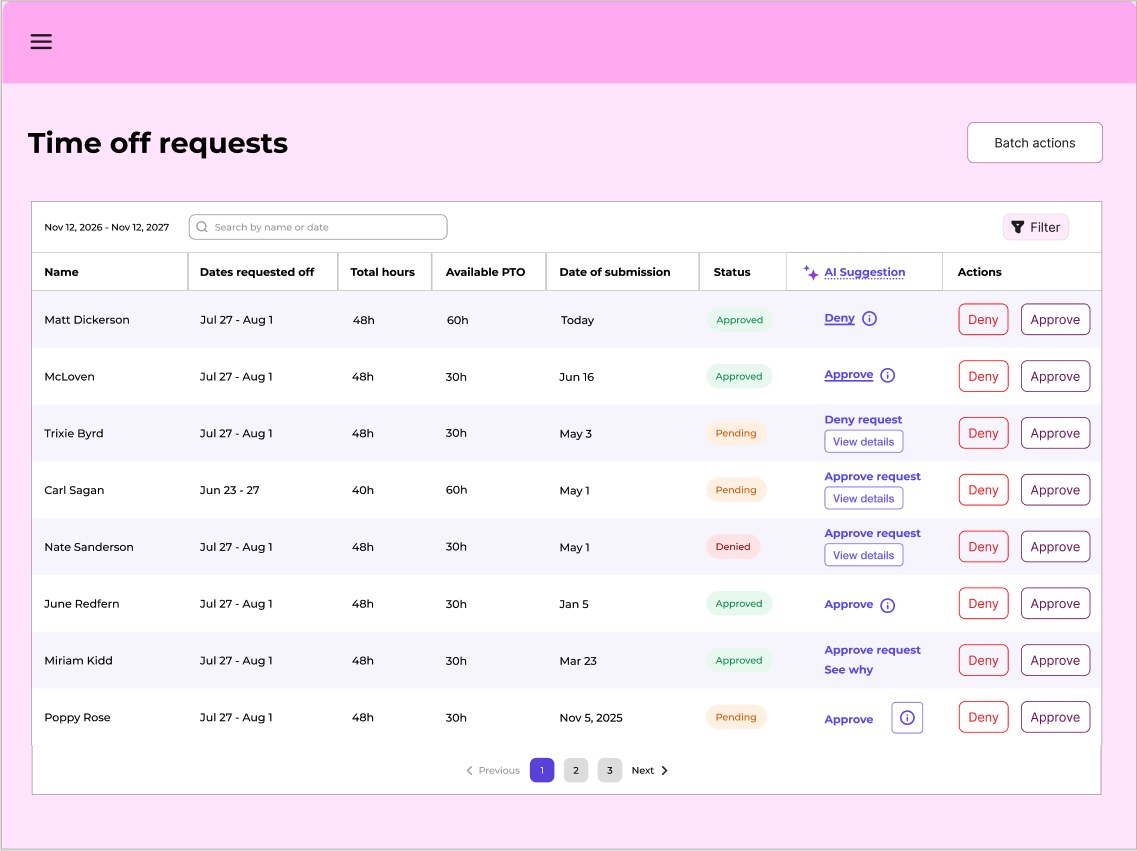
Iteration 5 — testing a secondary “View more” action.
03 · Visual hierarchy
Making AI assistance feel native to the product
The final refinement was about visual hierarchy.
Earlier explorations used purple text, sparkle icons, and other treatments to distinguish AI-generated content. But I began questioning whether the feature needed that much visual emphasis. The recommendations weren’t the primary task. Administrators were there to evaluate time-off requests and make decisions.
I brought the recommendation text and heading back to black, consistent with the rest of the table. I also moved the AI entry point to a tertiary interaction, giving the primary approval controls more room to breathe.
The result was a more restrained approach: AI assistance remained accessible without competing for attention or making itself the focal point of the experience.
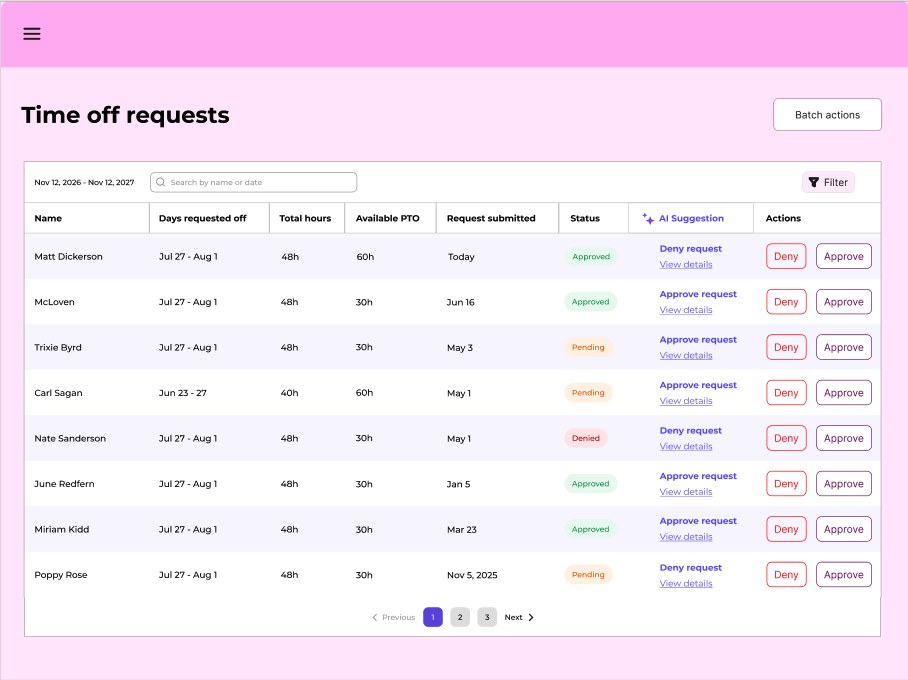
Iteration 6 — a more restrained approach to accessing AI recommendations.
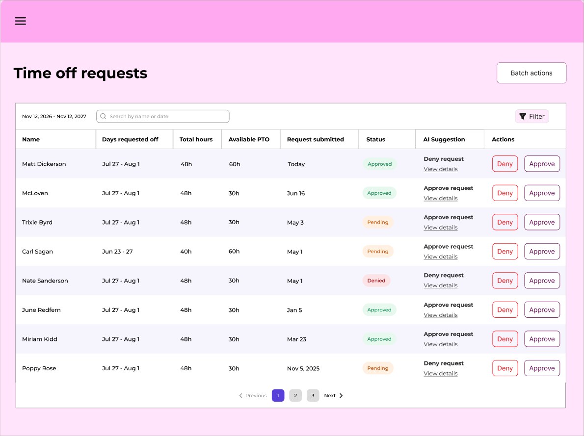
Iteration 7 — final proposed table design.
04 · Supporting experience
Exploring the information behind the recommendation
I also explored what administrators would see when they chose to view the AI’s supporting information.
The proposed readout provided additional context behind the recommendation, organizing information into expandable categories such as PTO, attendance, holidays, and staffing coverage. This allowed administrators to investigate the factors considered without overwhelming the primary interface with additional information.
It also maintained an important distinction: AI provided a recommendation, but the administrator retained responsibility for the final decision.
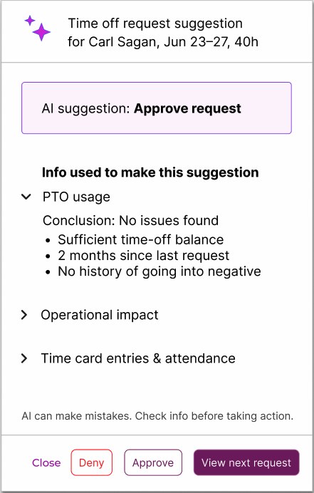
Supporting-information readout.
Outcome
A clearer, more integrated proposal
The final proposal established a clearer relationship between AI recommendations, supporting information, and administrator actions.
Through several rounds of independent exploration, I helped move the design beyond its initial content review and toward a more cohesive experience. The product designer was receptive to the proposed direction and implemented the design changes in the working mockups.
I left the company before the product was released, so I wasn’t able to confirm whether the final design shipped or evaluate its impact with users.
Reflection
Content design can shape more than words
Sometimes the biggest content problems aren’t solved by changing the words.
The initial design raised questions about information architecture, interaction patterns, and visual hierarchy. Addressing those problems required looking beyond individual labels and considering how information, actions, and supporting details worked together.
It was an opportunity to contribute to the product experience in a broader way—and to demonstrate how content design can influence the architecture and usability of a feature, even when the underlying functionality is outside the content designer’s scope.