- Issue
- Approach
- Solution
- Outcome
Issue
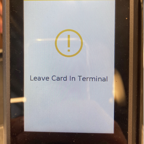
A credit card terminal at Whole Foods had jarring, confusing messaging that caused people to withdraw their card too quickly.
Approach
- I interviewed the cashier and learned that this was an ongoing issue
- I took a photo of the existing terminal
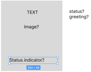
- I scratched out some notes about what was missing, and what an ideal experience might look like
- Then I opened Figma and got to work.

Solution
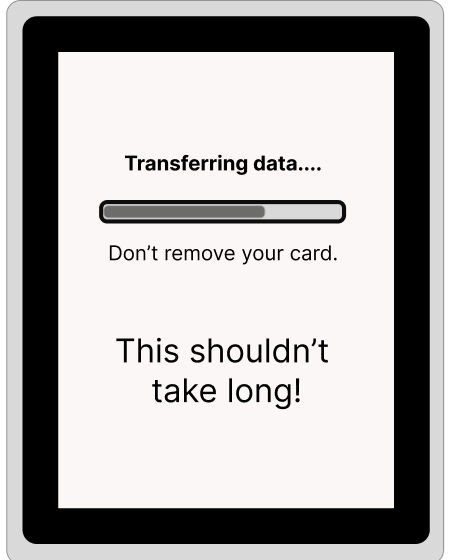
- By informing users in non-technical terms what is taking place, I felt my new design removed some confusion
- The addition of a status bar satisfies Nielsen’s first heuristic of interface design – Visibility of System Status
- I used a lighter touch to reinforce the need to leave the card in the machine
- A final message, friendly message adds a human touch and reassures users that things are moving along
Outcome
Speculative users found the updated experience clearer, reducing the chances of premature card removal, and speeding up checkout times!

